4 steps to a more cohesive Instagram feed
One of the things I get asked often by business owners is how they can make their Instagram feed more visually cohesive. Whilst a “pretty” feed can be beneficial (and fun!), I believe ensuring the content you share is genuine and helpful, is equally, if not more important.
I always recommend getting really clear on your brand strategy FIRST so you have a strong foundation and clarity for what your business is about. I’m talking about your brand’s purpose/why, your brand values, how you want to make your customer’s feel, and the key messages you’re communicating with your audience. The visuals come at the end, and I promise you, it makes things ALOT easier if you do it this way.
So, here’s 4 steps to a more cohesive Instagram feed:
1. Decide on the mood for your feed
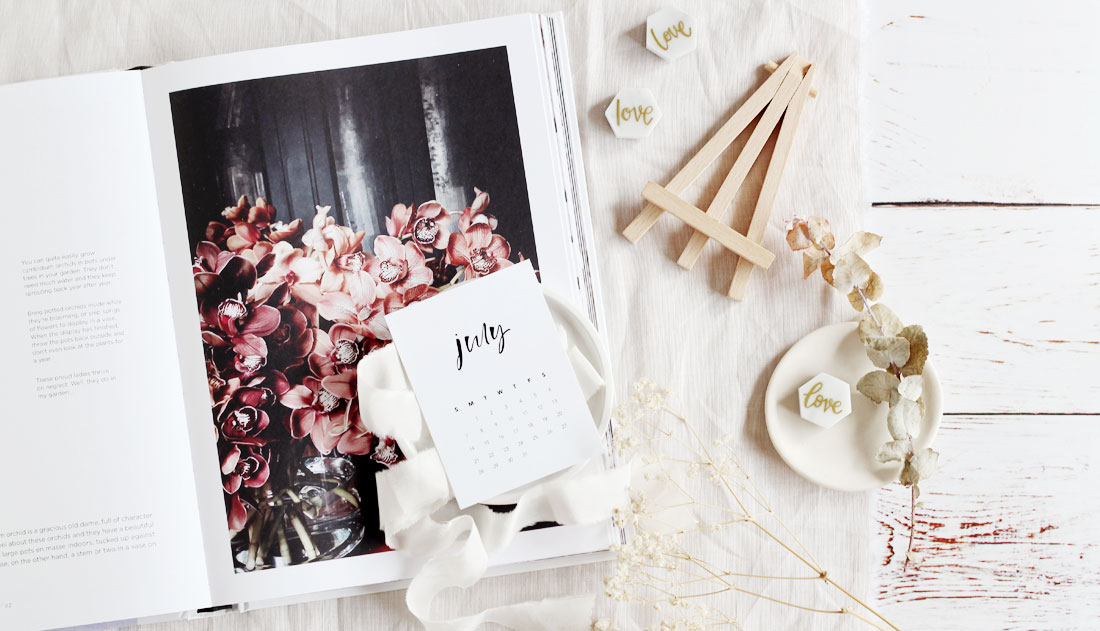
Before you start thinking about photos and editing, think about the mood you want for your feed. Start by jotting down key words. ie. light and airy, soft and elegant, warm and earthy, bold and happy. Notice how those word pairings trigger a visual feel in your mind already? From there you can create a mood board on Pinterest or use magazine cut outs. Look for inspirational images with colours that complement your brand colours.
2. Identify a colour palette
Use your mood board to identify the main colours you want in your feed. This will help guide you when choosing props, clothes and accessories for photo shoots. I like to have maybe 5-6 colours max.
3. Use a consistent filter/preset
The most popular photo editing apps are @lightroom or @vsco and you can purchase filters and presets to achieve a consistent look and feel across all your images. Just be prepared to do some additional editing tweaks yourself because you won’t be able to photograph in exactly the same lighting conditions every time.
4. Use a visual planning app
If you are super serious about planning out your images for your feed, @plannthat and @planoly are fantastic apps to use. Both have desktop versions which I love because typing captions on my phone is a bit fiddly.
Bonus tip:
If your want to introduce a new colour not previously in your colour palette, follow with at least two images with the new colour, within the next 9-12 squares. Not a hard and fast rule, but it helps the new colour blend in nicely. .
Hope you’ve found this helpful!
